The Struggle to Harness Excel
Project and technology developers often struggle to harness Excel. One of the main things they want to learn from their model is how sensitive a project is to changes in an assumption. For example, if the cost of fuel is 50% higher than the current estimate, what is the impact to IRR? Or if the actual offtake price is 20% lower than the current estimate, will the project still be financially viable? To answer these questions, modelers build sensitivity analyses.
The thing is, even modeling professionals struggle to rapidly build sensitivity analyses in Excel. This struggle is not the fault of the practitioner — rather, it stems from Excel's intrinsic lack of structure. At Aire Labs, we have listened to analysts, decision-makers, and dabblers to understand how they build and use modeling tools. Practitioners find sensitivity analyses valuable, but they frequently find themselves employing PG-13 vocabulary in their computer's general direction. At Aire, we are focused on working with our stakeholders, building industry specific software to let users build and learn more from their model while spending less time on configuration and de-bugging.
The Sensitivity Analysis Example
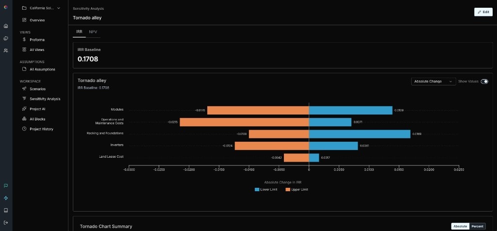
The two most common types of sensitivity analyses are tornado charts and what-if data tables. A tornado chart is a visual representation of how sensitive an output (e.g., IRR or NPV) is to the high and low cases of individual assumptions. They are used to bound potential outcomes across techno-economic analysis, project finance, risk analysis, financial planning, engineering, etc. A tornado chart looks like this:
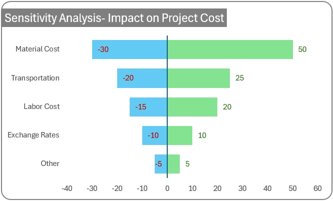
The thing is, tornados are a pain in Excel. Unless you have plugins or build out macros, you have to abuse the graphing tool in Excel to make this possible. There is no native tornado chart tooling in Excel:
- You have to do the analysis to generate the data, i.e., pick your highs and lows for each dependent variable and record results.
- Structure results so they can be graphed in a vertically oriented 100% stacked bar. (You actually need four data points for each row. The results you wish to graph and the remaining deltas on either side to round out to 100%)
- More clicking into unintuitive boxes, labeling, coloring, deleting labeling etc.
- If actually doing this, the best way used to be to fall down a YouTube rabbit-hole and pray. Now you can ask ChatGPT and pray.
- There must be a better way.
Data tables are uglier, but offer great functionality. This is what a data table looks like:
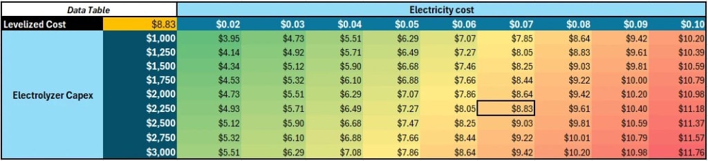
Data tables help a user understand how an output varies across a range of input values for one or two assumptions. In Excel, you have to structure a table yourself, including the labeling and beautification, but Excel will do the math for you. However, the user interface for building a data table is confusing and unhelpful. Data tables need to be on the same sheet as referenced input and output cells, which is annoying for those trying to cleanly structure and section workbooks. Selecting the right cell for "row input" and "column input" is also more confusing than it needs to be. While the user experience for building data tables in Excel is better relative to tornado charts, it remains not good.
Note: Decision makers, investors and creditors want to see tornado charts (and don't care about data tables) because they highlight which variables matter most in an easy and visually comparative way. Nitpicky modelers and analysts (like me) love data tables for their precise depiction of relationships.
The Benefits of Structure
Creating built-in sensitivity tooling exemplifies how structurally embedding modeling best practices and tooling can save users substantial time.
One of the glories of Excel is that there are no guardrails; it is completely customizable, and a super user can do nearly anything with enough effort. However, a blank canvas is a burden, taking logic and time to shape. At Aire, one of our key insights is that being confronted with a white screen, unlimited empty cells, and unformatted possibilities is not a benefit when it comes to project modeling. No matter the type of system or technology, every project has CapEx, OpEx, financial and technical assumptions. Pro formas conform to a similar best practice hierarchy. People want to show sensitivities as tornadoes and data tables. They want to be able to quickly generate, edit and compare project scenarios. They want to see similar output metrics on a project summary, like NPVs, IRRs and payback periods, and charts showing cash flows over time.
At Aire Labs, we are dedicated to helping project developers and technology entrepreneurs model and analyze their systems more quickly, more accurately, and with less frustration so they can focus on the hard work of securing funding and putting steel in the ground. While each model is unique to your project, the types of analyses modelers want to do are not. Aire offloads set-up and formatting challenges to a set of built-in, easy to use, and interrogable tools. It is designed to help work you need to do, not the burden of infinite possibilities.